Corso Sebastopoli - Paolo Borzone Architetto

↧
↧
House in Sonvico - Architetti Pedrozzi e Diaz Saravia
The one floor house leans on a slope and gets horizontality through two hollow pillars where secondary functions are placed.

© Pino Brioschi . Published on March 22, 2013.

© Pino Brioschi . Published on March 22, 2013.

© Pino Brioschi . Published on March 22, 2013.

© Pino Brioschi . Published on March 22, 2013.

© Architetti Pedrozzi e Diaz Saravia. Published on March 22, 2013.

© Pino Brioschi . Published on March 22, 2013.

© Pino Brioschi . Published on March 22, 2013.
↧
RESTAURO IN S. MARCO - MANCIN Antonio Filippo
Restauro in S.Marco con modificca dstributivo.

BAGNO INTERAMENTE IN MOSAICO
© MANCIN Antonio Filippo . Published on March 22, 2013.

ZONA GIORNO (PAVIMENTO IN LISTONI DI LEGNO ROVERE SBIANCATO TIPO ARTICO)
© MANCIN Antonio Filippo . Published on March 22, 2013.
↧
Corso Novara - Paolo Borzone Architetto
Rilievo del Piano Tetto e Sottotetto – Studio Preliminare per il Recupero Sottotetto a Fini Abitativi

© Paolo Borzone Architetto . Published on March 22, 2013.

© Paolo Borzone Architetto . Published on March 22, 2013.

© Paolo Borzone Architetto . Published on March 22, 2013.

© Paolo Borzone Architetto . Published on March 22, 2013.

© Paolo Borzone Architetto . Published on March 22, 2013.

© Paolo Borzone Architetto . Published on March 22, 2013.

© Paolo Borzone Architetto . Published on March 22, 2013.

© Paolo Borzone Architetto . Published on March 22, 2013.

© Paolo Borzone Architetto . Published on March 22, 2013.

© Paolo Borzone Architetto . Published on March 22, 2013.

© Paolo Borzone Architetto . Published on March 22, 2013.

© Paolo Borzone Architetto . Published on March 22, 2013.

© Paolo Borzone Architetto . Published on March 22, 2013.

© Paolo Borzone Architetto . Published on March 22, 2013.

© Paolo Borzone Architetto . Published on March 22, 2013.

© Paolo Borzone Architetto . Published on March 22, 2013.

© Paolo Borzone Architetto . Published on March 22, 2013.
↧
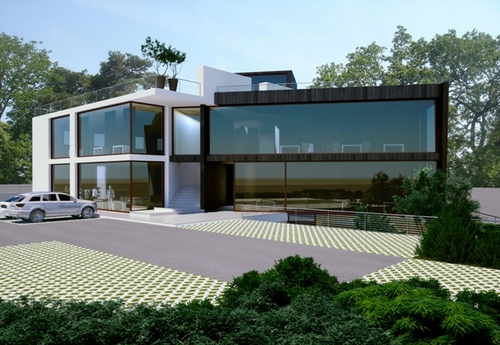
IN OUT - Michele Segala, Roberta Corradini
progetto architettonico per la realizzazione di un fabbricato commerciale per negozi e showroom
© Michele Segala . Published on March 22, 2013.

© Michele Segala . Published on March 22, 2013.

© Michele Segala . Published on March 22, 2013.

© Michele Segala . Published on March 22, 2013.
↧
↧
Entwicklungscampus Königinstrasse mit Neubau Forschungsbau Nano-Institut LMU München - bizer architekten, Koeber Landschaftsarchitektur
STÄDTEBAULICHES GESAMTKONZEPT_ Die Zielsetzung eines neu zu gestaltenden Universitätscampus in innerstädtischer Lage und optimaler Anbindung an den öffentlichen Verkehr bietet beste Voraussetzungen für die geplanten Universitätsgebäude. Für die dort Forschenden, Lehrenden und Lernenden soll ein großzügiger und kommunikativ-anregender Rahmen mit attraktiven Innen- und Außenräumen geschaffen werden. Als zusätzlicher Pluspunkt zur Innenstadtlage kommt die Besonderheit der Lage in der Isaraue, angrenzend an den Englischen Garten. Ziel ist es, die vorhandenen hochwertigen landschaftsräumlichen und städtebaulichen Zusammenhänge spürbar zu machen, qualitativ zu stärken und architektonisch angemessen umzusetzen. Die funktional-technischen Anforderungen sollen beiläufig integriert werden. Da der Campus über Jahre hinweg wachsen wird und mehrere Zwischenstufen bestehen werden, sollen während der unterschiedlichen Bauphasen auch mittelfristig qualitätvolle Räume und Raumsituationen entstehen. Schließlich wird der neue Isarcampus durch die optimalen Standortvoraussetzungen, seine attraktiven Innen- und Außenräume und seine hochwertigen Neubauten die Fakultät Physik der Ludwig-Maximilians-Universität in angemessener Weise repräsentieren. Dadurch wird der Exzellenz der Forschung ein nach außen sichtbarer, gebührender Ausdruck verliehen.

http://www.competitionline.com/de/beitraege/63420
© bizer architekten . Published on March 22, 2013.
BEURTEILUNG DURCH DAS PREISGERICHT_ Das angebotene modulare Konzept aus Bausteinen unterschiedlicher Abmessungen und Höhenentwicklungen wird als robuste, auch langfristig haltbare Entwicklungskonzeption angesehen, welche auch spätere Anpassungen an realen Nutzungsanforderungen erlaubt. Die beiden Bebauungsbänder entwickeln sich beiderseits einer inneren freiräumlichen und in ihrer Dimensionierung angemessenen Magistrale, von der aus alle Bausteine gleichberechtigt erschlossen sind. Zwischen den einzelnen Bausteinen ergeben sich lineare Durchblicke über beide Bänder hinweg zum Englischen Garten. Allerdings lässt diese orthogonale Anordnung nur bedingte Veränderungen der Bauvolumen in Nord-Süd-Richtung und vor allem nur zur Seite des Englischen Gartens zu. Etwa im Schwerpunkt dieser Magistrale wird die Durchwegung zurück zu Stadt und Park ohne Umwege in Verlängerung der Schackstraße angeboten, an die sich, ohne diese visuell oder wegemäßig zu blockieren, im Norden sowohl das Nano-Institut als auch die Mensa mit Bibliothek, auch ihrer Bedeutung entsprechend, sinnvoll platziert sind. Die barrierefreie Durchwegung ist über eine Rampe in der Böschung der Hangkante gegeben. Die Bausteine selbst sind auch für künftige Nutzungen bezüglich ihrer Abmessungen sinnvoll dimensioniert, wobei das Element der Höfe diese Volumen zwar angenehm gliedert, in seinen Abmessungen jedoch teilweise an Grenzen stößt, was die Belichtung und Belüftung anbelangt und den A:V-Wert ungünstig beeinflusst. Der Auftakt der Magistrale ist im Süden von der Veterinärstraße aus großzügig ausgelegt und wird durch eine auch öffentliche Cafeteria als Adresse des Campus aufgewertet. Dies gilt nicht in gleicher Weise für deren nördliches Pendant, das durch die Zufahrt zur Tiefgarage belastet ist. Dieser Ansatz müsste gegebenenfalls überprüft werden, da eine Konzentration auf eine einzige Tiefgarage, auch mit Rücksicht auf die Auswirkungen dieser Ein-und Ausfahrt auf die westliche Bebauung an der Königinstraße, kritisch beurteilt wird. Dagegen liegt die Kindertagesstätte gut erschlossen und mit ausreichenden Freiräumen in direktem Bezug zum Englischen Garten. Durch das Abrücken der Baukörper von der westlichen Hangkante kann diese bis zur Durchquerung herausgearbeitet und begrünt werden, ohne dass ein unangenehmes „Absacken“ der Baukörper entsteht. Auch bereits im ersten Bauabschnitt ist das Nano-Institut akzeptabel platziert, allerdings mit etwas zu geringem Abstand zum nördlichen anschließenden Bestand. Mit der deutlichen Ausformulierung der Hangkante entsteht zur Königinstraße ein großzügiger Freiraum, der durch den Platz am Nano-Institut auf der Höhenlage der Königinstraße sinnvoll unterbrochen wird. Damit entsteht eine hervorragende und eindeutige Verbindung zwischen Stadt und Campus. Der Abstand zum Englischen Garten ist ausreichend groß und wird durch Retentionsräume ökologisch und gestalterisch aufgewertet. Die innere Magistrale mit ihren Aufweitungen zu Plätzen weist eine besondere Qualität auf und es entstehen unterschiedliche Räume, die aber auch ganzheitlich erlebbar sind. Die Anbindung des Nano-Instituts an die Magistrale ist durch die große Freitreppe ausgezeichnet und richtig gelöst. Insgesamt sind die Freiräume hervorragend durchgearbeitet, so dass ein neuer Stadtbaustein besonderer Qualität entstehen kann. Auch die südliche Eingangssituation mit historischem Portal ist sehr gut gelöst.
↧
Showroom ONEYONE - FEDERICA RIZZARDI, martina comelato, denis miglioranza, aldo capodaglio
prototipo negozio
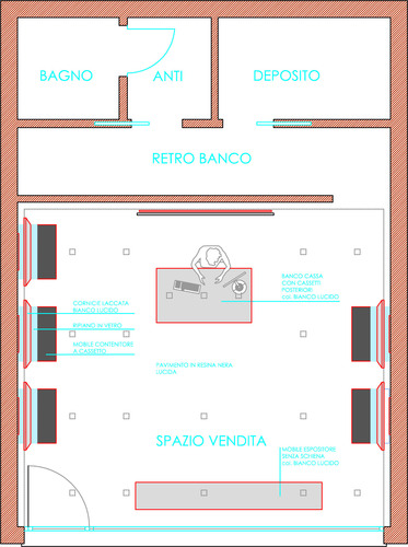
Pianta
© FEDERICA RIZZARDI . Published on March 22, 2013.

PROSPETTO 1
© FEDERICA RIZZARDI . Published on March 22, 2013.

PROSPETTO 2
© FEDERICA RIZZARDI . Published on March 22, 2013.

PROSPETTO 3
© FEDERICA RIZZARDI . Published on March 22, 2013.

PROSPETTO 4
© FEDERICA RIZZARDI . Published on March 22, 2013.

RENDER
© FEDERICA RIZZARDI . Published on March 22, 2013.

RENDER
© FEDERICA RIZZARDI . Published on March 22, 2013.

RENDER
© FEDERICA RIZZARDI . Published on March 22, 2013.
↧
Hotel et centre de Thalassothérapie - Ciel Rouge
Le paysage est dynamique mais serré, la côte découpée, les lignes sont tendues de montagnes, de vagues blanches; l’architecture s’insère dans le même élan.

© Ciel Rouge . Published on March 22, 2013.
Cette réalisation reflète une nouvelle culture liée à l’eau de mer profonde, ouvrant des nouveaux modes d’aborder le bien-être. Les formes sont simples, enveloppantes, relaxantes: cavités douces, baies, ondulations. Les fenêtres rondes, les alcôves rappellent des gouttes d’eau, des lunes ou des hublots de bateaux: les courbes adoucissent, le cercle rassure, l’horizontalité calme.

© Ciel Rouge . Published on March 22, 2013.

© Ciel Rouge . Published on March 22, 2013.

© Ciel Rouge . Published on March 22, 2013.

© Ciel Rouge . Published on March 22, 2013.

© Ciel Rouge . Published on March 22, 2013.
↧
Laboratorio di composizione - Angelo Torre
ANGELO TORRE, ANDREA ORLANDO

© Angelo Torre . Published on March 22, 2013.
Siamo partiti da due presupposti fissati: 1) confrontarci con l’ampliamento di volume, senza reinventare l’abitazione dal nulla, ma confrontandoci con le preesistenze; 2) grande considerazione del contesto bucolico, in modo da non stravolgere l’ambiente in cui già si trovava l’edificio, ma diventarne parte.
Partendo da questa considerazione abbiamo risolto il problema delle grosse dimensioni (altezze spore i 5 metri), evidenziando la dimensione lineare rispetto a quella verticale, in modo da esaltarne l’orizzontalità piuttosto che le altezze.
L’idea di base da cui abbiamo mosso consisteva nel ricreare una sorta di cortile con peristilio da casa romana. In questo caso però, distaccandoci via via dall’ideale di partenza, abbiamo ricreato una sorta di “piazza quadrata”, giustapponendo un corpo di dimensioni simili al blocco più basso della casa in modo perpendicolare a questo. Anche grazie all’aiuto delle falde inclinate verso l’interno viene così ricreato un ambiente bucolico, aperto verso la pendenza del terreno.
Questa soluzione inoltre, ci ha permesso di dare un forte senso di equilibrio all’edificio nella sua interezza. Le due metà si confrontano in modo del tutto bilanciato, con un piacevole alternarsi delle inclinazioni dei tetti a falda e di pareti piane, quasi superfici pure, con altre bucate e aperte.
Ne risulta un forte contrasto e una forte contraddizione fra i due lati principali di questa “casa di campagna”. Il lato interno è aperto e caratterizzato da un movimento avanti/indietro delle sue parti. A questo dinamismo interno si contrappone la superficie lineare e l’ermetismo del lato esterno, che con distacco non permette da fuori di essere penetrato.
Infine il salone principale, poiché risulta senza aperture (se non quelle che si affacciano perpendicolarmente alla cucina sulla piazza quadrata), riceverà la luce da una grossa apertura nel tetto. Infatti viene ritagliato un cortiletto interno, chiuso da una parete e da vetri che permettono l’ingresso abbondante di luce. In questo cortiletto vi sarà piantato un albero che spunterà oltre il tetto per dare continuità di visione dall’esterno alla vegetazione e all’ambiente circostante. In questo modo la casa, concdendo questa intrusione al suo interno, diviene parte del contesto o perlomeno completamente attanagliata ad esso.
↧
↧
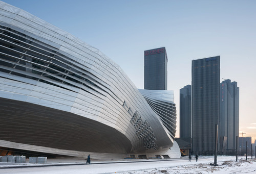
Dalian International Conference Center - Coop Himmelb(l)au
The building has both to reflect the promising modern future of Dalian and its tradition as an important port, trade, industry and tourism city. The formal language of the project combines and merges the rational structure and organization of its modern conference center typology with the floating spaces of modernist architecture.

© Duccio Malagamba . Published on March 22, 2013.
Dalian is an important seaport, industrial, trade, and tourism center, located in the southernmost part of the Liaodong Peninsula in the Chinese Liaoning Province. The city is currently undergoing a wave of transformation on coastal brownfield and reclaimed land which will entirely change the city’s face within the next decade.

© Duccio Malagamba . Published on March 22, 2013.
The key developments are:
Dislocation of container port away from the dense city area
Establishment of international port for cruise ships
New development of a „CBD – Central Business District“ on reclaimed land
Bridge over the sea to connect with the special economic zone

© Duccio Malagamba . Published on March 22, 2013.
The urban design task of the Dalian International Conference Center is to create an instantly recognizable landmark at the terminal point of the future extension of the main city axis. As its focal point the building will be anchored in the mental landscape of the population and the international community. The footprint of the building on the site is therefore arranged in accordance with the orientation of the two major urban axis which merge in front of the building. The cantilevering conference spaces that penetrate the facades create a spatially multifaceted building volume and differentiate the close surroundings. The various theaters and conference spaces are covered by a cone-shaped roof screen. Through controlled daylight input good spatial orientation for the visitors and atmospheric variety is assured.

© Duccio Malagamba . Published on March 22, 2013.
The project combines the following functions within one hybrid building with synergetic effects of functionality and spatial richness.
Conference Center
Theater and Opera House
Exhibition Center
Basement with Parking, Delivery and Disposal

© Duccio Malagamba . Published on March 22, 2013.
A public zone at ground level allows for differentiating accessibility for the different groups of users. The actual performance and conference spaces are situated at +15,30 m above the entrance hall. The grand theater, with a capacity of 1.600 seats and a stage tower, and the directly adjacent flexible conference hall of 2.500 seats, are positioned at the core of the building. With this arrangement the main stage can be used for the classical theater auditorium as well as for the flexible multipurpose hall. The main auditorium is additionally equipped with backstage areas like in traditional theaters and opera houses. This scheme is appropriate to broaden the range of options for the use of this space: from convention, musical, theater even up to classical opera, with very little additional investment.
© Duccio Malagamba . Published on March 22, 2013.
The smaller conference spaces are arranged like pearls around this core, providing very short connections between the different areas, thus saving time while changing between the different units. Most conference rooms and the circulation areas have direct daylight from above. Through this open and fluid arrangement the theater and conference spaces on the main level establish a kind of urban structure with “squares” and “street spaces”. These identifiable “addresses” facilitate user orientation within the building. Thus the informal meeting places, as well as chill-out and catering zones, and in between the halls, gardens with view connection to outside are provided as required for modern conference utilization. The access to the basement parking garage, truck delivery and waste disposal is located at the southwest side of the site, thus freeing the front driveway to the entrances from transit traffic. The main entrance from the sea side corresponds to the future developments, including the connection to the future cruise terminal.

© Duccio Malagamba . Published on March 22, 2013.
Technical, Climatic and Environmental Concept
The focus of the architectural design and project development lies on technology, construction and their interplay. The technical systems fulfil the tasks required for the spatial use of the building automatically, invisibly and silently.
With the Dalian International Dalian Conference Center, these systems work like a hybrid city within a building. For the technical infrastructure of the building this means, that we have to consider a huge amount of people circulating inside the building at the same time, who expect high standards in circulation and comfort as well as a state of the art building with respect to high flexibility, low energy consumption and low use of natural resources.
Technical areas in the basement supply infrastructure within a rectangular grid, mainly inside the vertical cores. In particularly the conference zone has to be provided with a sufficient amount of air in order to maintain a high level of thermal and acoustical comfort. Therefore the conditioned air will be silently injected into the rooms via an inflated double flooring underneath the seating. Air blowout units inside the stairs will ensure consistent air distribution. Due to the thermal uplift, the heat of the people ascends to the ceiling and is extracted by suction.

© Duccio Malagamba . Published on March 22, 2013.
One of the major tasks of sustainable architecture is the minimisation of energy consumption. A fundamental contribution is to avoid considerable fluctuations in demands during the course of the day. Therefore it is essential to integrate the natural resources of the environment like:
Use the thermal energy of seawater with heat pumps for cooling in summer and heating in winter
General use of low temperature systems for heating in combination with activation of the concrete core as thermal mass in order to keep the building on constant temperature
Natural ventilation of the huge air volumes within the building allows for minimization of the mechanical apparatus for ventilation heating and cooling. The atrium is conceived as a solar heated, naturally ventilated sub climatic area.
In the large volume individual areas can be treated separately by additional measures such as displacement ventilation
A high degree of daylight use is aspired both for its positive psychological effect and for minimizing the power consumption for artificial lighting
Energy production with solar energy panels integrated into the shape of the building.

© Duccio Malagamba . Published on March 22, 2013.
Structural Concept
The structural concept is based on a sandwich structure composed of 2 elements: the “table” and the roof.
Both elements are steel space frames with depths ranging between 5 and 8 meters.
The whole structure is elevated 7 meters above ground level and is supported by 14 vertical composite steel and concrete cores.
A doubly ruled façade structure connects the two layers of table and roof, creating a load-bearing shell structure.
The application of new design and simulation techniques, the knowledge of local shipbuilders to bend massive steel plates, and the consumption of more than 40,000 tons of steel enables breathtaking spans of over 85 meters and cantilevering of over 40 meters.

© Duccio Malagamba . Published on March 22, 2013.
Planning
COOP HIMMELBLAU
Wolf D. Prix / W. Dreibholz & Partner ZT GmbH
Design Principal: Wolf D. Prix
Project Partner: Paul Kath (until 2010), Wolfgang Reicht
Project Architect: Wolfgang Reicht
Design Architect: Alexander Ott
Design Team: Quirin Krumbholz, Eva Wolf, Victoria Coaloa
Project Team: Nico Boyer, Liisi Salumaa, Anja Sorger, Vanessa Castro Vélez, Lei Feng, Reinhard Hacker, Jan Brosch, Veronika Janovska, Manfred Yuen, Matthias Niemeyer, Matt Kirkham, Peter Rose, Markus Wings, Ariane Marx, Wendy Fok, Reinhard Platzl, Debora Creel, Hui-Cheng, Jessie Chen, Simon Diesendruck, Yue Chen, Thomas Hindelang, Pola Dietrich, Moritz Keitel, Ian Robertson, Keigo Fukugaki, Gaspar Gonzalez Melero, Giacomo Tinari, Alice Gong
Model Building: Nam La-Chi, Paul Hoszowski, Taylor Clayton, Matthias Bornhofer,
Katsyua Arai, Zhu Juankang, Lukas Allner, Phillip Reiner, Moritz Heinrath, Olivia Wimmer, Silja Wiener, Katrin Ertle, Maria Zagallo, Logan Yuen, André Nakonz, Arihan Senocak, Rashmi Jois, Sachin Thorat, Marc Werner
3D Visualization: Isochrom.com, Vienna; Jens Mehlan & Jörg Hugo, Vienna

© Duccio Malagamba . Published on March 22, 2013.
Local Partner:
DADRI Dalian Institute of Architecture Design and Research Co. LTD
UD Studio, Dalian, P.R. China
J&A Interior Design, Shenzhen, P.R. China
Structural Engineering:
B+G Ingenieure, Bollinger Grohmann Schneider ZT-GmbH, Vienna, Austria
DADRI Dalian Institute of Architecture Design and Research Co. LTD, Dalian, P.R China
Acoustics: Müller-BBM, Planegg, Germany: Dr. Eckard Mommerz
Stage Design: BSEDI Beijing Special Engineering Design and Research Institute, Beijing, P.R. China
Lighting Design: a•g Licht, Wilfried Kramb, Bonn, Germany
Audio & Video: CRFTG Radio, Film and Television Design & Research Institute, Beijing, P.R. China
Climatic Design: Prof. Brian Cody, Berlin, Germany
HVAC, Sprinkler:
Reinhold A. Bacher, Vienna, Austria
DADRI Dalian Institute of Architecture Design and Research Co. LTD, Dalian, P.R. China
Façade : Meinhardt Facade Technology Ltd. Beijing Branch Office, Beijing, P.R. China
Photovoltaic: Baumgartner GmbH, Kippenheim, Germany
General Contractor: China Construction Eight Engineering Division, Dalian, P.R. China

© Duccio Malagamba . Published on March 22, 2013.
Chronology
Competition: 03/2008
Start of Planning: 07/2008
Start of Construction: 11/2008
Completion: 2012
Site Area: 40,000 m²
Gross Floor Area Conference Center: 91,250 m²
Gross Floor Area Parking: 24,400 m²
Gross Floor Area total: 117,650 m²
Footprint: 33,000 m ²
Gross Cubage above ground: 1,250,000 m³
Gross Cubage underground: 220,000 m³
Façade Area: 30,600 m²
Roof area: 28,000 m²
Building Height: 60 m
Building Length: 220 m
Building Width : 200 m
Number of Floors: 8

© Duccio Malagamba . Published on March 22, 2013.

© Duccio Malagamba . Published on March 22, 2013.

© Duccio Malagamba . Published on March 22, 2013.

© Duccio Malagamba . Published on March 22, 2013.

© Duccio Malagamba . Published on March 22, 2013.

© Duccio Malagamba . Published on March 22, 2013.

© Duccio Malagamba . Published on March 22, 2013.

© Cristiano Bianchi. Published on March 22, 2013.

© Cristiano Bianchi. Published on March 22, 2013.

© Coop Himmelb(l)au . Published on March 22, 2013.

© Coop Himmelb(l)au . Published on March 22, 2013.

© Coop Himmelb(l)au . Published on March 22, 2013.

© Coop Himmelb(l)au . Published on March 22, 2013.

© Coop Himmelb(l)au . Published on March 22, 2013.

© Coop Himmelb(l)au . Published on March 22, 2013.

© Coop Himmelb(l)au . Published on March 22, 2013.

© Coop Himmelb(l)au . Published on March 22, 2013.

© Coop Himmelb(l)au . Published on March 22, 2013.
↧
PALAZZO PROVINCIALE DEL LAVORO DELL’AQUILA - Alberto Apostoli
Il progetto parte dalla ristrutturazione di un condominio degli anni 60, parzialmente danneggiato dal sisma nelle sue partizioni verticali, per il quale, dopo alcuni interventi di legatura degli snodi strutturali principali, è stata realizzata la completa rivisitazione funzionale e architettonica. La ristrutturazione ha anche implicato la costruzione di parcheggi interrati e la sistemazione del terreno di pertinenza. Questo edificio è il primo intervento di riqualificazione di un comparto che include quattro edifici, in fase di progettazione, e la cui realizzazione è prevista nei prossimi tre anni. L’edificio è isolato sui quattro lati; non presenta una vera e propria facciata, ma si configura come una piccola torre su cui tutte le singole facciate hanno pari importanza. Tali facciate sono state attentamente pensate e realizzate attraverso piccole sporgenze geometriche a cui sono abbinati colori diversi ma complementari e in cui le aperture sono costituite da imbotti aggettanti. La realizzazione delle sporgenze avviene attraverso la diversificazione dello spessore della coibentazione esterna (cappotto) con una particolare attenzione alla finitura. Gli imbotti, bordati esternamente in acciaio lucido, accolgono serramenti in legno di rovere e contribuiscono all’illuminazione notturna di facciata. Il movimento geometrico e raffinato dei volumi crea, durante le varie ore della giornata, leggere variazioni che conferiscono all’edifico una dinamicità inaspettata.

Photo by Tommaso Cassinis. Published on March 22, 2013.
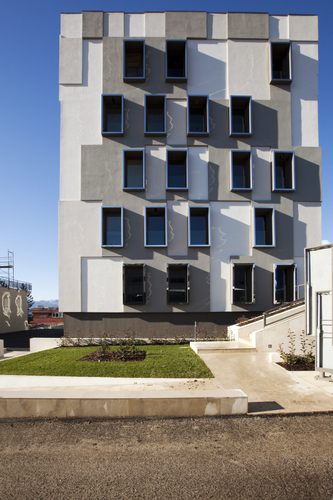
Photo by Tommaso Cassinis. Published on March 22, 2013.
Photo by Tommaso Cassinis. Published on March 22, 2013.
© Alberto Apostoli . Published on March 22, 2013.
Photo by Tommaso Cassinis. Published on March 22, 2013.
Photo by Tommaso Cassinis. Published on March 22, 2013.
↧
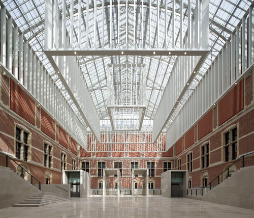
Rijksmuseum - Cruz y Ortiz Arquitectos
Following a European tender process, Spanish architects Cruz y Ortiz Arquitectos of Seville were chosen by a committee chaired by the chief government architect Jo Coenen to lead the transformation of the Rijksmuseum. Cruz y Ortiz proposed minimal alterations to the building itself. The firm has recreated the clear layout conceived by the museum’s original architect, Pierre Cuypers, stripping the building of its later additions to ensure that it is once again a coherent whole.
The result transforms the 19th century building into a bright and spacious 21st century museum. The new Rijksmuseum features an impressive new entrance area; a new Asian Pavilion; a new outdoor exhibition space and garden; state-of-the-art facilities including new dining spaces, a shop, a restored library and auditorium; renewed education facilities, a new service entrance, a separate building for the conservation of the collection; and climate-control and security features, which are in line with today’s requirements.
Also restored to their former glory are the high-ceilinged, spacious, late 19th century galleries. In keeping with the plan to restore the building where possible, the original monumental ornaments that decorated the walls and ceilings will be returned to the Gallery of Honour, the Grand Hall, the Night Watch Gallery and the stairwells. Cuypers‘ hallmark is best preserved in the library where the original design and ornaments have largely been maintained.
The French interior architect Jean-Michel Wilmotte, whose work for the Louvre has earned him international acclaim, was invited to devise the interior design for the transformed Rijksmuseum. He has created all display elements for the galleries that complement the restored 19th century museum, including the display cases, plinths, lighting and furniture. In consultation with Cruz y Ortiz, Wilmotte has also determined the interior colour scheme, which has been inspired by Pierre Cuypers’ palette for the building.
© Pedro Pegenaute . Published on March 22, 2013.
Atrium
Cruz y Ortiz have created an impressive new entrance area suitable for the needs of a leading international museum. The museum’s two inner courtyards have now been opened up, with the removal of galleries that were added in the 1950s and 1960s.
A two-part, 2,250 square-metre Atrium has been created by sinking the floor of the two courtyards below ground level and connecting them via an underground zone beneath the original passageway through the building. The Atrium can be accessed from the passageway, which features glass walls through which passersby can admire the view of the courtyards.
The Atrium features large glass-covered roofs and pale polished Portuguese stone floors that reflect the natural light, making the voluminous courtyard spaces feel airy and bright. Overlooking the courtyards are the warm brick façades of the surrounding museum buildings, interspersed with windows and niches.
The light-filled Atrium is a welcoming space in the heart of the museum, and can be accessed by all visitors even without a ticket. Located within the entrance area are a café, the ticketing booth and a cloakroom.

© Pedro Pegenaute . Published on March 22, 2013.
Asian Pavilion
Designed by Cruz y Ortiz, the free-standing Asian Pavilion is situated facing the Museumplein in the garden to the south of the Rijksmuseum, and is surrounded by water. The irregular-shaped, two-storey structure stands out against the red brick walls of the Rijksmuseum, with its walls faced in pale Portuguese stone and glass. It is characterised by many sloping walls and unusual sightlines. The pavilion is linked to the main building via an underground passageway.
The Asian Pavilion has been created to showcase objects and works of art from China and Japan, Indonesia and India, Vietnam and Thailand, dating from 2000 BC to 2000 AD. The museum’s rich collection of Asian art is harmoniously presented in the 670 square-metre space, with a total of 365 objects on display.
On the opposite side of the garden, between the Cuypers Villa and the Teekenschool (Drawing School), Cruz y Ortiz have placed another small new building – the new service entrance, offering access to the museum via an underground passage.

© Pedro Pegenaute . Published on March 22, 2013.
New “outdoor museum”
The transformation of the Rijksmuseum has included the opening up of a large, outdoor public space for visitors, in the form of a 14,500 square- metre historic garden. Based on a 1901 design by Pierre Cuypers, the garden’s new layout was created by the Dutch landscape architecture firm Copijn Landschapsarchitecten.
The garden features several of the original formal garden styles, as well as restored statues and fragments of ancient buildings. A fountain, pond, greenhouse, and children’s garden will soon be added to this “outdoor museum”. A Henry Moore exhibition will open in the garden on 21 June 2013, the first in an annual series of international sculpture exhibitions to be held each summer.

© Pedro Pegenaute . Published on March 22, 2013.
The Atelier Building
The Atelier Building is a venue for the preservation and management of Dutch cultural heritage, housing a centre for restoration and conservation, scientific practice, research and education. It opened in 2007, and accommodates departments from both the Rijksmuseum and the University of Amsterdam.
Developed by the Government Buildings Agency and commissioned by the Rijksmuseum and the Ministry of Education, Culture and Science (OCW), the Atelier Building is the first structure by Cruz y Ortiz to be completed as part of the Rijksmuseum renovation.
Covering a surface area of more than 9,000 square-metres, the Atelier Building merges a new structure with an existing building designed by Pierre Cuypers, known as the Safety Institute. The building’s brick façade complements that of the Rijksmuseum and its surrounding buildings, yet the architects have created an easily recognisable silhouette to help identify the building.
Functionality was the main consideration in the building’s design. The unusual ‘zigzagging’ roof structure, the glazed northern elevation, and angled, triangular-shaped windows of the side-wall ensure that only northern light is admitted, to avoid direct sunlight. All the studios, hallways, doors and lifts are higher and wider than usual, facilitating easy passage for large works of art.

© Jannes Linders. Published on March 22, 2013.
Teekenschool
The Rijksmuseum’s multidisciplinary education centre will be situated in the historic Teekenschool (Drawing School). The renovation has restored the school building to its original function as a space for learning, enriching the museum experience by providing opportunities for art enthusiasts of all ages to take part in specially created programmes revolving around the Rijksmuseum collection.
Established in 1892, the Teekenschool owes its name to its original function as a drawing school, a forerunner of the Gerrit Rietveld Academy. The concept and design of the building was developed by architect Pierre Cuypers, who envisioned it as a place that would help to improve national art education.
The restored building will be the most comprehensive museum education centre in the Netherlands. Connected by the theme of ‘learning to look by doing’, the centre’s three modern studios will accommodate a varied range of activities.

© Jannes Linders. Published on March 22, 2013.
Philips Wing
During the ten-year transformation of the Rijksmuseum, the Philips Wing has remained open to the public, with the exhibition Rijksmuseum, The Masterpieces. The Philips Wing will close for renovation in March. Cruz y Ortiz will lead the design, and the space will be converted into a new home for temporary exhibitions.

© Jannes Linders. Published on March 22, 2013.
↧
Wildland Conservancy - Artefact, Inc.
The two main functional components of this 3,100 square foot, one story building are classroom space and administrative office space, essentially forming two zones separated by a central corridor. The classroom area has been developed as flexible space with folding partitions that can form up to three separate spaces for inside instruction. The administrative area includes a common space for several work stations and file cabinets, a private office, a room for office equipment and supplies, and a kitchen. The lobby and corridor have been set up to be not only circulation space but also as places for displays and education. A large covered front porch has been developed as an outdoor classroom and staging area for educational forays onto the Conservancy grounds. The Center has been designed with a “green roof” which is covered with soil and planted with low-maintenance plants for conservation and energy reasons.

Exterior View
@ Artefact, Inc.. Published on March 22, 2013.
Environmental PrioritiesEnergy Saving: The building has been designed with a continuous thermal barrier around its entire conditioned space. Recycled cellulose insulation completely fills the wall cavities between wood studs and has been laid above ceilings, while ridged insulation boards have been installed under floor slab areas. Super-efficient triple-paned fiberglass windows with two layers of low-E film have been installed to minimize heat loss. The “green roof” prevents the overheating of the attic space and reduces cooling loads during the warmer seasons.

Green Roof - Summer
@ Artefact, Inc.. Published on March 22, 2013.
Passive Solar: The building has been oriented on the site so that the longest side of the building faces south. More and larger windows have been placed on the south wall to allow winter sun to penetrate interior spaces and warm materials including the concrete slab floor that can store heat and lessen the demand on the heating system. Broad roof overhangs shade those windows during the summer, preventing overheating.

Green Roof - Winter
@ Artefact, Inc.. Published on March 22, 2013.
Energy-efficient Lighting: The classroom and administrative spaces of the Center include high-efficiency HOT5 direct-indirect fluorescent lighting that reduces the number of fixtures required to adequately light the spaces while using less energy to run. Their long lamp life also offers maintenance savings. Lobby and corridor areas are illuminated using energy-saving compact fluorescent recessed lighting and low-voltage track lighting.

Exterior View
@ Artefact, Inc.. Published on March 22, 2013.
Daylighting: The administrative areas have the advantage of an abundance of natural light that reduces the amount of artificial light needed. Daylighting also has the extra benefit of being very desirable to users and helps to create spaces that people want to inhabit. Material Conservation: Finishes were minimized in order to conserve materials and keep the budget low. The concrete floor slabs ere pigmented and sealed to eliminate the necessity of using other surface treatments. Window and other wood trims were kept to a minimum.

Entryway
@ Artefact, Inc.. Published on March 22, 2013.
Recycled Materials: Materials made from waste have been incorporated throughout the Center. On the exterior, engineered lumber siding panels have been made from recycled wood fibers and many components of the green roofing system have been made with recycled materials. Inside, the cellulose insulation in the walls and above the ceiling is made from recycled newspaper and the cabinets have been constructed using wheatstraw board made from waste material.
Reduction of rainwater run-off and heat islanding: The “green roof” that covers the main portion of the Center significantly reduces the amount of rainwater the building sheds, thus reducing run-off into the landscape. This roof also eliminates the heat build-up usually associated with roofing and so reduces the possible affect on area microclimates.
↧
↧
Istanbul Concept Store - Matteo Trogu Architetto, Riccardo Cafiso, Jacopo Saleri, Martina Vincenzi
Questo concept store si sviluppa al piano terra (1000 metri quadrati) di un edificio situato nel quartiere di Cihangir, Istanbul. L’idea nasce dalla volontà di dare al negozio lo spirito teatrale che pervade questo particolare distretto di Istanbul, senza perdere di vista la filosofia della Maison. Da qui la decisione di utilizzare materiali riciclati, ecosostenibili e di facile reperimento, dai colori desaturati. Un’area apparentemente improvvisata, ma dove tutto è stato progettato nel dattaglio. Al fine di promuovere le vendite, il gruppo ha proposto di utilizzare la “Guerrilla Marketing” facendo circolare un tram tipico locale colmo di casse bianche e, contemporaneamente, improvvisando un Flash Mob con una folla di persone in abiti bianchi firmati Martin Magielà. L’assenza di vetrine e l’ingresso realizzato all’interno di un tunnel in calcestruzzo riprendono la filosofia del no-logo propria di questo brand: unico riferimento al marchio è rappresentato dai tipici numeri della collezione, riportati a spry all’accesso della galleria. Il cancello di ferro, che proteggere lo spazio al momento della chiusura, verrà installato al centro del tunnel per non perdere l’effetto scenografico del “vicolo urbano”. Per accedere allo spazio reale del negozio, il visitatore sarà costretto a passare attraverso tre strati del prestigioso tessuto e provare, sulla propria pelle, le sensazioni che tale ordito è in grado di trasmettere. L’open space accoglie gli ospiti con un muro di cuscini in tipico stile locale (nei tessuti desaturati) e caratterizzato da un grande controsoffitto retroilluminato in barrisol. I principali materiali sono legno ed il cemento, mentre le colonne e gli espositori sono rivestiti da pellicole argentate e specchiate. Le scarpe e gli accessori saranno esposti in casse di legno bianco, mentre gli abiti saranno appesi a telai in ferro battuto. Il pavimento è in cemento liscio e trattato con resine. Questo Concept Store si ispira ad un vero è proprio spazio urbano per suggerirne l’utilizzo in forme differenti: come rappresentazioni o sfilate di mode per esempio.
Fitting Room
© Matteo Trogu Architetto . Published on March 22, 2013.

Open Space_wall pillow
© Matteo Trogu Architetto . Published on March 22, 2013.

Open Space_purchase area
© Matteo Trogu Architetto . Published on March 22, 2013.

exposition walk_start
© Matteo Trogu Architetto . Published on March 22, 2013.

Vip Area
© Matteo Trogu Architetto . Published on March 22, 2013.

Vip Area
© Matteo Trogu Architetto . Published on March 22, 2013.

exposition box
© Matteo Trogu Architetto . Published on March 22, 2013.

exposition
© Matteo Trogu Architetto . Published on March 22, 2013.

exposition walk_exit
© Matteo Trogu Architetto . Published on March 22, 2013.

stairs
© Matteo Trogu Architetto . Published on March 22, 2013.

fitting room_entrance
© Matteo Trogu Architetto . Published on March 22, 2013.

fitting room
© Matteo Trogu Architetto . Published on March 22, 2013.

purchase area
© Matteo Trogu Architetto . Published on March 22, 2013.
↧
Patchi Gourmandines - lautrefabrique architects
The historic souks of Beirut, located in the renovated area of Solidere, in the city center were destroyed by civil war in Lebanon. They were completely rebuilt by the Spanish architect Rafael Moneo and reopened in 2009. It is in this new commercial and tourist complex that the Lebanese chocolate maker Patchi has opened a new shop.

© Luc Boegly. Published on March 22, 2013.
On this occasion Patchi has decided to break with the codes that have contributed to his reputation throughout the Middle East, with “chocolate jewels” presented on a plexiglass cone. No display stands, but only the boxes of the extensive “Gourmandine” range.

© Luc Boegly. Published on March 22, 2013.
The shop is located at the corner of two indoor streets, facing a very busy square. The site covers only a small area – just over 25m2 – but has a comfortable height – 7m – and the creation of a mezzanine was strongly suggested by the client. However the installation of a staircase and an elevator at the rear of the shop proved to take up too much space. The architect then suggested enhancing the double-height by a scenic device favoring its expression.

© Luc Boegly. Published on March 22, 2013.
The trapezoidal shape of the plan highlights the perspective and the perception of the depth of the shop transforming this cramped area into a generous space opening onto the outside. The linear display of products is located in hollows in the walls that hug the contours of the trapezoid. Boxes and chocolate bars are displayed on cantilevered shelves that run along the whole length of the wall and whose spacing varies to accommodate all sizes of products. Linear LED’s installed under each shelf highlight the product facings.

© Luc Boegly. Published on March 22, 2013.
The lower walls are smooth, concealing stock cupboards At the top, the cantilevered shelves look like streaks on the full height. They incorporate a system of indirect lighting that allows the multiple perforations in the ceiling to be preserved.

© Luc Boegly . Published on March 22, 2013.
The counter, with a Macassar ebony veneer, houses the till and the sound equipment and enables new products from the “Gourmandine” range to be presented.

© Luc Boegly. Published on March 22, 2013.
To the rear, a screen, which repeats the shapes and materials of the counter serves as storage for bags hanging from hooks made from brushed stainless steel.

© Luc Boegly. Published on March 22, 2013.

© Luc Boegly. Published on March 22, 2013.

© Luc Boegly. Published on March 22, 2013.

© Luc Boegly. Published on March 22, 2013.

© Luc Boegly. Published on March 22, 2013.

© Luc Boegly. Published on March 22, 2013.

© Luc Boegly. Published on March 22, 2013.

© Luc Boegly. Published on March 22, 2013.
↧
cambodian sustainable housing - Marco Dimiziani, Cristina Ortolani
GENERAL APPROACH The main aim of the project is providing a self urbanism model giving to the inhabitants the opportunity to decide where to situate a home, the way in which the individual relates with his surroundings, how to lead the future growth of the house, how to address the growing process of the urban fabric in an indeterminate open way to facilitate urban land regularization and prevent slum expansion through participatory lay-out planning The open combination, neither exact nor repetitive, between full and empty, regular and irregular furthers a flexible idea of code where the order resides in this possible shared directionality, rather than in the strict, rigid, conforming, sterile, repetition of events.

© Marco Dimiziani . Published on March 22, 2013.
DESIGN PRINCIPLE The design objectives are: • conservation of traditional construction method, • improved use of natural material and the possibility of self-construction, • construction embedded in the local cultural context that can be produced locally, • improvement of local employment and know-how to minimize the need for import and transportation. • use of climate conditions in order to minimize energy consumption • building elements transportable and reusable

© Marco Dimiziani . Published on March 22, 2013.
TIPOLOGY DESCRIPTION The units layout, according to the family needs, will follow the expanding ratio of the wood-bamboo structure based on the m.3,60×4,20 module till a maximum gross building area of 50,00 sqm the detached bamboo roofing structure provide shadow and rain protection to the room units, filtering the sun in the patios and improving cross ventilation The modular system allows the increase of the space by reutilization of demountable panels to guarantee flexible extensions and connections. This allows household to build annexes to accommodate relatives arriving in town as displaced people then. Since cooking is generally done in two places, the kitchen and the courtyard, The kitchen is a shared separate space in the house that has a sink and some cupboards to store pots and pans and other kitchen utensils facing into the ground patio. There is a store room attached to the kitchen The toilet facilities will be located along the border brick wall according to the installations provided

© Marco Dimiziani . Published on March 22, 2013.

© Marco Dimiziani . Published on March 22, 2013.
↧
AMBASSADOR MANSION - Stile interior-architecture
L’edificio originale della Residenza risale a circa gli anni ’20 del primo novecento. Tra il 1946 e 1948 fu destinato ad Ambasciata della Romania e in seguito a sede dell’Agenzia delle Nazioni Unite. In quell’epoca si costituiva di un solo corpo centrale rispetto al lotto con un giardino davanti al fronte principale e un giardino molto profondo sul retro, seguendo quindi lo schema tipologico della villa neoclassica europea di quegli anni. Nel 1950 l’edificio sarà ristrutturato per diventare Museo nazionale di Lenin e Stalin. La ristrutturazione prevede l’aggiunta dell’ala laterale per creare nuove sale espositive e un apparato decorativo esterno tra cui il frontone con il grande timpano sorretto da quattro grandi colonne corinzie. Questo tipo di intervento darà all’edificio una connotazione fortemente neo rinascimentale, richiamandosi al linguaggio architettonico utilizzato per tutte le tipologie degli edifici museali in Europa durante tutto l’ottocento e il novecento. Ma se il riferimento alle ville palladiane in facciata è così forte, non lo è altrettanto il sistema distributivo interno, che invece di svilupparsi attorno ad un salone centrale a doppia altezza segue uno sviluppo lineare ad elle con una serie di saloni che si inseguono e che si affacciano solo ad un lato verso corte interna. Dopo esser diventato Casa della Cultura ed essere stato successivamente abbandonato, nel 1991 viene acquistato dallo Stato Italiano per restaurarlo e farne diventare la Residenza dell’Ambasciata d’Italia. Il restauro, realizzato dalla ditta Lattanzi di Roma, si concentrerà soprattutto nella ristrutturazione architettonica dell’edificio (rifacendo solai, copertura, esterni e parti delle murature) e terminerà nel 1992.

Photo by Allessandro Boscolo Agostini ©stile interior-architecture. Published on March 22, 2013.
In tutti i documenti ritrovati ed esaminati non è stata trovata alcuna menzione o traccia di particolari apparti decorativi interni, se non alcuni elementi posti durante il restauro del 1990. Cosicchè, la scelta progettuale per il restyling interno, si è mossa autonomamente cercando di ricreare degli spazi che richiamassero la classicità delle ville dei primi anni del novecento con elementi e dettagli tipici del deco’ italiano (soffitto in vetro retroilluminato, cornici e sagomature scalettate, boiserie in legno, ecc.). Nel progetto si è voluto anche inserire alcuni elementi di contemporaneità che in qualche modo esprimessero il design, l’artigianalità e l’innovazione del made in italy e che interpretassero il principio progettuale della trasparenza e del collegamento ideale e visivo tra interno ed esterno e tra i due giardini. Il parterre d’ingresso è stato ridisegnato reinterpretando tipici disegni deco e riutilizzando la forma bizantino-romana della spirale, realizzandolo con mosaico di marmo secondo la più antica tradizione italiana dei pavimenti esterni pregiati. Il lampadario in vetro soffiato di murano all’ingresso, dalle forme contemporanee riporta il centro dell’asse visivo tra interno ed esterno e si riflette nella nuova bussola d’ingresso in cristallo trasparente. La corte interna, esaltata da una pavimentazione con un nuovo materiale in ricomposto di legno dalla tenace resistenza alle intemperie è delimitata da un vasca d’acqua su cui si ergono due setti rivestiti in mosaico di vetro che omaggiano il futurismo italiano e in particolare l’arte di Gino Severini. Quest’atmosfera che ricorda gli elementi legati al mare è esaltata da una nuova tensostruttura che staglia le sue vele al vento.

photo by Allessandro Boscolo Agostini © stile interior-architecture. Published on March 22, 2013.

Photo by Allessandro Boscolo Agostini ©stile interior-architecture. Published on March 22, 2013.

Photo by Allessandro Boscolo Agostini ©stile interior-architecture. Published on March 22, 2013.

Photo by Allessandro Boscolo Agostini ©stile interior-architecture. Published on March 22, 2013.

Photo by Allessandro Boscolo Agostini ©stile interior-architecture. Published on March 22, 2013.

Photo by Allessandro Boscolo Agostini ©stile interior-architecture. Published on March 22, 2013.

Photo by Allessandro Boscolo Agostini ©stile interior-architecture. Published on March 22, 2013.

Photo by Allessandro Boscolo Agostini ©stile interior-architecture. Published on March 22, 2013.

Photo by Allessandro Boscolo Agostini ©stile interior-architecture. Published on March 22, 2013.

© Stile interior-architecture . Published on March 22, 2013.

Photo by Allessandro Boscolo Agostini ©stile interior-architecture. Published on March 22, 2013.
↧
↧
Biglietterie Stagionali - Daniele Volo - Architetto, Alberto Gallo
...
© Daniele Volo - Architetto . Published on March 22, 2013.

© Daniele Volo - Architetto . Published on March 22, 2013.

© Daniele Volo - Architetto . Published on March 22, 2013.

© Daniele Volo - Architetto . Published on March 22, 2013.

© Daniele Volo - Architetto . Published on March 22, 2013.

© Daniele Volo - Architetto . Published on March 22, 2013.

© Daniele Volo - Architetto . Published on March 22, 2013.

© Daniele Volo - Architetto . Published on March 22, 2013.

© Daniele Volo - Architetto . Published on March 22, 2013.
↧
Northampton County Courthouse - Artefact, Inc., Christine Ussler, Lucienne Di Biase Dooley
In the fall of 2009, the County of Northampton received an Energy Efficiency and Conservation Block Grant. The Energy Efficiency and Conservation Block Grant (EECBG) Program, funded for the first time by the American Recovery and Reinvestment Act (Recovery Act) of 2009, represents a Presidential priority to deploy the cheapest, cleanest, and most reliable energy technologies we have—energy efficiency and conservation—across the country. The Program, authorized in Title V, Subtitle E of the Energy Independence and Security Act (EISA) and signed into law on December 19, 2007, is modeled after the Community Development Block Grant program administered by the Department of Housing and Urban Development (HUD). It is intended to assist U.S. cities, counties, states, territories, and Indian tribes to develop, promote, implement, and manage energy efficiency and conservation projects and programs designed to: • Reduce fossil fuel emissions; • Reduce the total energy use of the eligible entities; • Improve energy efficiency in the transportation, building, and other appropriate sectors; and • Create and retain jobs. The scope of work of the original Request for Proposals included two different contract programs, work that would be funded by the EECBG and a separate program for exterior repairs that did not involve energy efficiency. The EECBG program was to replace 163 existing windows of the historic courthouse and make repairs associated with the window replacements and other energy related building envelope problems such as closing unused vents. The program for the non-EECBG work was to repair areas of the historic courthouse that had suffered from years of deferred maintenance and included the metal cornices, front columns, built-in gutters and downspouts. As part of the grant requirements, all work had to be reviewed by the Pennsylvania Historic and Museum Commission for compliance with the Secretary of the Interior’s Standards for the Treatment for Historic Properties and by the Department of Energy for compliance with the EECBG and the Recovery Act (ARRA).

Front View After Restoration
@ John Harry. Published on March 22, 2013.
PROJECT NARRATIVE: One of the major challenges of the initial program was to satisfy requirements of both the Department of Energy (DOE) and the Pennsylvania Historic and Museum Commission (PHMC). After a thorough interior and exterior building analysis utilizing a high lift for exterior conditions, room by room interior inspections, and occupant surveys, it was determined that the project should be reconsidered as a window restoration effort. The existing historic wood windows were in surprisingly good condition especially considering the lack of maintenance and regular painting for decades. The monumental wood windows were repaired where necessary with consolidants and fillers, reglazed with traditional glazing compound, and repainted. The treatment of the rectangular double-hung windows included similar repairs plus the replacement of single strength glass with insulating glass with adhered exterior muntins that simulate the original muntins and glazing compound.

Front View Before
© Artefact, Inc. . Published on March 22, 2013.
The energy efficiency of the historic windows was addressed through interior storm panels for the monumental courtroom and entry windows and retrofitting the rectangular double-hung windows with insulating glass and new weather stripping. The client requested continued operability for most of the double-hung windows in offices and in areas where fresh air might be desired in the future. In order to satisfy this need the windows were modified to be single-hung, the upper sash weights removed, and weight pockets insulated. The lower sashes remain operable with recalibrated weights to counterbalance the weight of the heavier glass. The two major window types were tested for energy efficiency before and after renovation. The results proved the efficacy of the window repair strategy and met all DOE expectations.

Monumental Windows Before
© Artefact, Inc. . Published on March 22, 2013.
Other work undertaken to reduce energy use and improve the historic integrity of the building included the removal of the 1940’s window wall in the eastern stair and recreation of the smaller former monumental window, the removal of window alterations and re-creation of the smaller original window on the east façade of the 1860 courthouse, and the blocking in of unused grills in the exterior stucco walls. The new insulated glass window installations increased the area of insulated wall resulting in less heat loss through the walls and windows. Air infiltration through the exterior walls was reduced with the closing of many grills.

Monumental Window After
© Artefact, Inc. . Published on March 22, 2013.
The cost to repair rather than replace the historic windows was significantly less than the estimates to replace the windows prepared for the EECBG submission. The additional grant money was used to upgrade and renovate additional features of the building resulting in greater energy efficiency for the building. This work included the replacement of the existing deteriorated roofing and box gutter linings. Many layers of old asphalt roofing were removed, new sheathing installed over the rough roofing boards, and new roof shingles with cooling granules installed. The deteriorated EPDM box gutter linings were removed, repairs made to the wood substructure, and new, light colored Sarnafil PVC membranes installed in the gutters.

Downspouts before and After
© Artefact, Inc. . Published on March 22, 2013.
Repairs to the exterior of the building not covered by the energy efficiency grant included repairs to the existing stucco masonry, repairs to the pressed metal cornices, replacement of undersized and deteriorated downspouts, and the installation of a new lightning protection system.

Stairwell Windows Before
© Artefact, Inc. . Published on March 22, 2013.
The entire historic courthouse was also repainted. This work was covered, in part, by the EECBG grant where the building was affected by the window repairs, window replacements, and alterations to the envelope for energy efficiency. The question of colors for the historic courthouse came up early in the design phase. A consultant was hired to undertake an historic paint analysis to understand the original colors of the courthouse and the types of paint used so that new paints would be compatible with the old. We worked closely with the consultant, County Executive, President Judge, and the Director of Public Works to derive the new color scheme. This scheme is the best approximation of the original colors found on the courthouse at the end of the multiple building campaigns ending in 1909.

Stairwell Window After
© Artefact, Inc. . Published on March 22, 2013.
Several of the challenges of the project included site access for equipment, construction in an occupied public building, and the removal of unexpected lead paint and asbestos. Our design work was expanded to include the design of an access ramp that would become permanent at the conclusion of construction. This permanent ramp will provide access for future work, maintenance, and emergency vehicles. The design of the ramp is based on terraces that were present in the original site design and will be minimally visible in its final form (construction work on ramp to be completed in the next month). Working in an occupied institution building posed challenges for the contractor’s schedule and methods. In close collaboration with an industrial hygienist and the county safety committee all work was monitored and modified to accommodate county workers and the active court schedule in the historic courtrooms.
↧
Un Autogrill per TUTTI - Onofrio Romagno , Donato Macario, Francesco Errede
Per la progettazione degli spazi è stata utilizzata una visione prospettica umana e non una assonometrica che privilegia l’oggetto. Temi fondamentali sono la fruibilità e la leggerezza, fruibilità che si evince nella pianta attraverso un percorso semplice ed intuitivo che parte dalla composizione del vassoio e dopo le varie fasi termina nello spazio dedicato al consumo dei pasti. Altro tema importante è quello di non aver creato differenze fra gli utenti o zone riservate, tutti gli oggetti e gli ambienti contemplano una totale e paritetica fruibilità. Nella progettazione degli oggetti è evidente il ricorso al tema della leggerezza e dell’accessibilità, tutto appare sospeso per non creare intralci ai clienti e ai dipendenti dell’autogrill (per esempio nelle operazioni di pulizia), a partire dai tavoli sospesi che possiedono un’altezza variabile, per finire con l’utilizzo di cavi che sospendono per esempio gli elementi di composizione dei vassoi. La leggerezza è riscontrabile inoltre nell’utilizzo dei materiali, come vetro e materiali plastici traslucidi che compongono tavoli e bancone; il gioco d’acqua sulla parete con il logo Autogrill e le ampie vetrate che dividono e diagrammano gli ambienti. Per quanto riguarda gli Autogrill esistenti, ne sono stati presi in esame alcuni e nel nostro programma esigenziale abbiamo cercato di risolvere alcuni problemi che limitavano una fruizione totale dell’ambiente. Per esempio abbiamo notato nella parte dedicata alla composizione del vassoio evidenti problemi di raggiungimento degli oggetti da parte di utenti come bambini, o persone con difficoltà motorie, abbiamo cercato di sopperire a questo ostacolo con un semplice soluzione di moduli disposti a colonna su varie altezze in modo da poter essere raggiunti da tutti. Dopo la fase di composizione del vassoio (posate, tovaglioli ecc…) si passa alla somministrazione delle pietanze, che include piatti freddi e caldi. Nei moduli degli esempi analizzati, sono lampanti alcune pecche per quanto riguarda l’accessibilità ai vari ripiani dove sono conservati gli alimenti, per questo abbiamo cercato di produrre un bancone simile nella forma a quelli convenzionali, dotato di piccoli accorgimenti atti a garantire una migliore accessibilità; lo stesso accorgimento che consiste in un sistema di piani a scorrimento estraibili è stato mutuato anche nella progettazione del frigorifero, visto come punto critico negli attuali self-service. Un altro problema fondamentale riscontrato in altri esempi è stata la complessità della disposizione planimetrica degli arredi, che costringe il pubblico ad un percorso intricato e confuso. In questo senso la nostra scelta è orientata a fornire percorsi semplici e lineari come descritto in pianta, al di là delle dimensioni del tutto orientative. Infine la nostra attenzione si è soffermata anche nell’operazione di trasporto del vassoio già composto fino al tavolo ed abbiamo considerato ad esempio una famiglia tipo composta da genitori e uno o più bambini, che si trova nella situazione di trasportare tre, quattro o più vassoi fino ai tavoli. Abbiamo deciso di fornire ad essi l’ausilio di un semplice carrello su cui porre in maniera stabile vassoi e bevande. Questo dispositivo può anche essere utilizzato come una sorta di sostegno da parte di una clientela anziana durante l’attesa.

© Onofrio Romagno . Published on March 22, 2013.
ZONA COMPOSIZIONE VASSOI Abbiamo adottato un sistema a mensole sospese, ancorate con appositi supporti a cavi in acciaio fissati al bancone e al soffitto. In questo modo si viene a creare un sistema regolabile di mensole organizzate in colonne, nelle quali vengono stoccati in senso verticale rispettivamente: vassoi, tovaglioli, posate, pane e piatti, in modo tale che ogni utente può servirsi dalla mensola posta all’altezza a lui più facile da raggiungere.

© Onofrio Romagno . Published on March 23, 2013.
TAVOLO A VITE CONTINUA Si tratta di un tavolo circolare ancorato al soffitto per mezzo di una barra in acciaio di sezione circolare, che presenta una filettatura all’estremità inferiore. Tale sistema ci consente di regolare l’altezza del tavolo alle esigenze dei commensali mediante la semplice rotazione di esso. L’altezza risulta quindi regolabile a partire da una normale posizione seduta fino ad un’altezza in cui è possibile consumare un pasto fugace in piedi o su uno sgabello, passando ovviamente per posizioni intermedie capaci di soddisfare la postura di tutti i clienti.

© Onofrio Romagno . Published on March 23, 2013.
VETRINA PER PIETANZE FREDDE E CALDE A partire dall’analisi di vetrine bancone esistenti, abbiamo sentito l’esigenza di creare un sistema che facilitasse l’accesso alle pietanza sia da parte dei clienti, che dagli addetti dell’Autogrill. Questa vetrina presenta quindi dei piani scorrevoli che avvicinano letteralmente le portate ai clienti in modo che essi possano raggiungere in maniera agevole anche le portate più lontane. Allo stesso tempo anche l’impiegato può rifornire le vetrine in modo più semplice e veloce.

© Onofrio Romagno . Published on March 23, 2013.
CARRELLO PORTA VASSOI Si tratta di un carrello dotato di ruote che consente di trasportare in sicurezza più vassoi lungo il percorso di composizione fino alla zona sedute. Si compone di una struttura in acciaio tubolare che funge anche da presa a in cui è inserita una struttura in materiale plastico su cui vengono posti i vassoi e il loro contenuto, la parte superiore presenta dei fori nei quali vengono alloggiate le bevande che in questo modo non rischiano di versarsi. Questo dispositivo consente inoltre ad un pubblico ad esempio di anziani un valido appoggio durante tutto il percorso.

© Onofrio Romagno . Published on March 23, 2013.
SUPPORTO TAVOLO PER BAMBINI Questo supporto permette ad un pubblico di bambini autosufficienti di poter consumare un pasto insieme ai familiari su un piano di appoggio idoneo alla loro statura, perché un bambino piccolo posto su una normale seduta è impossibilitato al raggiungimento dell’altezza di un normale tavolo. E’ composto semplicemente da un piano concavo che presenta nella parte posteriore dei morsetti per ancorarlo al tavolo e regolarne l’altezza.
↧
More Pages to Explore .....


